Enhancing & Simplifying Data Exploration in Microsoft Power BI
Performing Correlation and Labeled Scatterplot Analysis are key activities in the very initial phase of Data Analysis often referred to as Data Exploration.
The ultimate objective of such phases is to identify meaningful (not necessarily) linear models that describe an outcome.
Although theoretically such tasks are very connected, in practice their execution is frequently slow and complicated.
Developed by CPS Analytics, CPS Correlogram++ is a Microsoft Power BI Custom Visual thought to facilitate such task making it as easy and fast as possible.
The basic idea behind this component is simple:
- obtaining a Correlogram by simply dragging numeric columns in the Visual “values” field in Power BI Visualization panel;
- obtaining a contextual scatterplots related to each correlation by simply clicking correlation tiles in order to have an idea of what the shape of the correlation is to inform further analysis;
- since correlations might exist locally but not globally (and vice versa) depending on other categorical or numeric variables and they can be biased by certain co-variate conditions, Corrplot++ users have the ability to label data points to have them shown in different colors depending on the value of an additional variable and get points highlited by clicking the label corresponding to such additional variable on the scatterplot legend thus enabling what is referred to as an interactive cluster analysis.
Let’s explore these concepts through a practical example.
The following Correlogram shows a weak inverse correlation (Pearson’s Correlation Coefficient of -0.17) between values from fields “PD % of Votes” and “Lega % of Votes”.
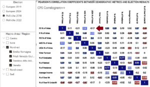
Clicking the corresponding tile the visual shows-up a scatterplot of values from the two fields whose points are colored depending on a choosen label (e.g. the italian region).
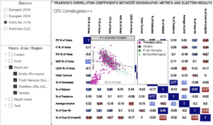
This second visual information clearly shows that for all the selected regions, except one, the specific correlation has one shape (descending from left to right) while for “Trentino-Alto Adige” is the opposite, thus suggesting that for all the regions, except “Trentino”, the selected inverse correlation might be much more significant.
This drives us to filter the region out of the selection to get the corresponding Correlogram in which values from “Trentino-Alto Adige” are excluded.
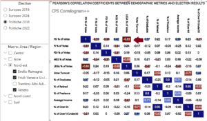
The updated Correlogram confirms the hypothesis suggested by the contextual scatterplot analysis as it shows that, for the same set of values, the inverse correlation coefficient has risen (in terms of significance) to a noticeable -0.83 demostrating the importance of contextual correlation and labeled scatterplot analysis.
In addition, scatterplot header shows the equation of the regression line indicating the coefficient that describes the general tie between the couple of corresponding values coming from the two columns.
You can check CPS Corrplot++ live at DATITALIA – CPS
For forther info refer to: analytics@cpsweb.it